Insurance web application navigation redesign
John Hancock Insurance

Our client’s customer insurance portal is a critical touchpoint for policyholders and Customer Service Representatives (CSRs). Policyholders use it to find answers to questions, manage their policies, and discover services that make decisions easier.
In November 2019, we started work on a consolidated customer insurance portal to reduce a user’s reliance on the CSRs.
We focused on uncovering customer pain points via CSR interviews, site analytics, customer feedback, and moderated usability tests. Our research indicated we would have an outsized impact on user behavior and satisfaction if we focused on improving the findability and the usability of high-value tasks.
Role
Self
Content inventory and audit
Collaboratively wrote research plans
Conducted Customer Service Representative interviews and shadowed live calls
Ran unmoderated remote usability tests
Conducted Card Sort interviews
Designed prototypes
Contributed to data analysis and shared findings with stakeholders
Design team
Collaboratively wrote research plans
Conducted Customer Service Representative interviews and shadowed live calls
Ran unmoderated remote usability tests
Conducted Card Sort interviews
Ran Tree Test studies
Contributed to data analysis and shared findings with stakeholders
Methods
Interviewing
Ethnographic research in the form of shadowing/observation
Treet testing
Open card sort interviews
Usability testing
Problem
Our goal was to reduce the number of calls to the call center and minimize management resources regarding the Life, Long-term Care (LTC) and Annuities customer insurance portal functionality through updating content, improving navigation, and inform features in a centralized design system.
How might we re-organize customer insurance portals to reduce costs and increase policyholder satisfaction?
Users
Insurance Policyholders
When it comes to insurance portals, there are a plethora of user types. We focused on policyholders with an online account for their LTC, Life, or Annuities policies.
The Vision
A single customer insurance portal with task-based navigation allows CSRs to confidently direct customers to the right tools and resources to solve their problems.
For customers, the vision is for a single customer storefront, enabling a customer to manage all their policies.
For customer service representatives, the vision is to help customers feel confident about taking control of their policy management.
For internal product owners, the vision is to enable their teams to use fewer resources to manage their customer portals by leveraging standard components, features, and content.
Design Process
Project Kickoff
Our client was focused on updating the “look and feel” of the insurance portals in the initial kickoff meeting to match the latest company branding. With one of the design teams focused on a centralized design system, the project sounded like a walk in the park; however, as we continued our discussion, we surfaced a need to increase the insurance portal’s NPS scores.
Discovery
We started by collecting and analyzing customer feedback from intercept surveys. After reviewing our findings, it was clear that the insurance portals had more pressing issues to address.
We put together a presentation to prove to our client that to meet customers’ expectations of a self-service portal that provides value requires understanding and matching customer’s needs, behavior, and mental models would require more than just updating the “look and feel.”
Customer Service Representative Interviews
As part of our presentation, we pitched a research plan to interview and shadow our client’s Customer Service Representatives (CSR). One of our primary success metrics was reducing call center volume. To do this, we needed to understand more about the CSR’s workflow and how they interact with customers.
Specifically, we wanted to understand what insights CSR’s had about customer’s pain points when interacting with the portal and better understand the customer’s mental model when they call into the call center.
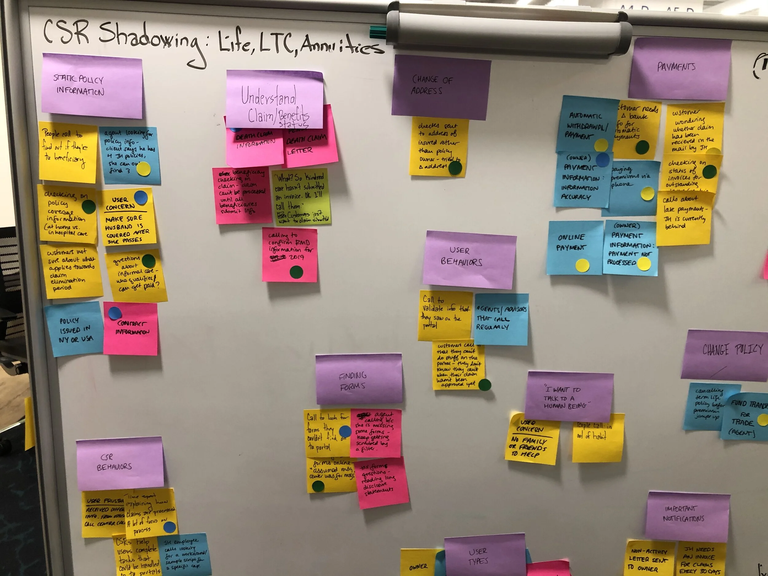
Notes from shadowing CSR interviews affinity mapped on a white board
After our interviews, we affinitized our notes and extracted the following insights:
Telling vs. showing. The site’s navigation forces users to learn how it works, rather than meeting user’s expectations of how to accomplish a task.
Invisibility of system status. There’s no transparency about whether claims, invoices, or policy requests are being processed on the client’s end or require more action on the user’s part.
Information overload. There is an overwhelming amount of information presented regardless of what is relevant to the customer. Users require navigation that is more task-focused, with information hierarchy and functionality determined by what they need to accomplish their highest priority goals.
Current State Content Audit
I worked with the lead designer to document the existing state of insurance portals. Lacking administrative access, we focused on documenting the portals from the customer’s perspective. From the content audit, we were able to create sitemaps for each portal.
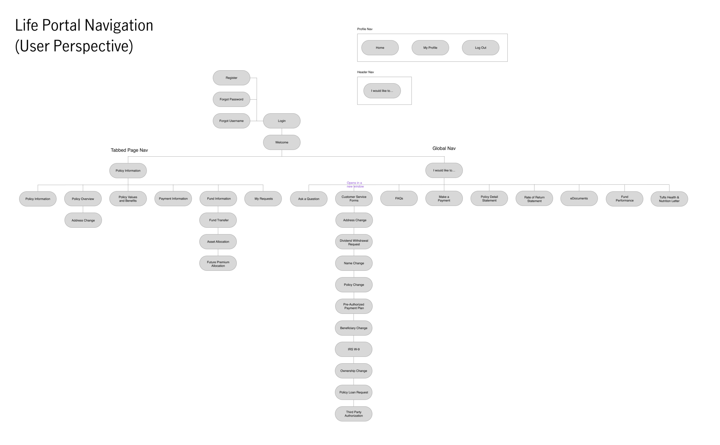
Current state Life Insurance Portal sitemap
Card Sorts
Using the sitemaps, we facilitated discussions with the product owners--the managers that oversee each insurance portal--which gave us a clear picture of all the content on the insurance portals.
To remedy the insurance portals’ information architecture (IA), we need to understand how customers understood and organized the tools and information related to their policy. To do this, we put together a research plan to conduct moderated card sort interviews.
Preparing the card sort was the most challenging part of the process. We needed to present users with a number of cards that could be sorted easily in a short time, but the cards also needed to be representative of all of the content on the insurance portals.
Leveraging the content inventories, we wrote cards for all of the portals’ content; this came out to some 90+ cards for each insurance portal. We met with the product owners to condense and rephrase the cards until we had sets of 30 cards for each portal. With our cards ready, we divided up interviews amongst the three of us. Conducting 2-4 interviews a day for two weeks, we ended up with plenty of user feedback for our post-analysis.
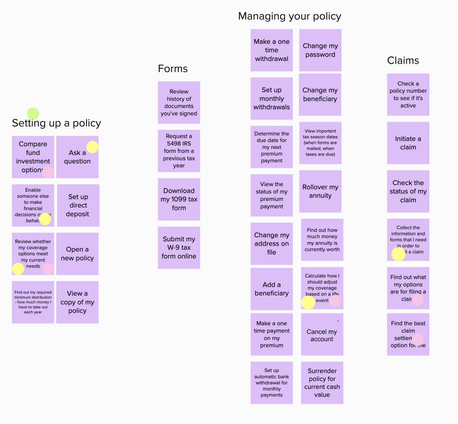
Card sort interview conducted with Mural and Usertesting.com
Analysis and further evaluation through Tree Testing
Some category names were reasonably simple to sort. We made an educated guess based on the feedback and observations we noted from the interviews for categories that we were less confident.
From our new categories, we were able to construct a new navigation scheme. We immediately arranged unmoderated tree tests with remote users. Asking users how they would expect to complete tasks related to their policy using the navigation helped prove the new scheme’s effectiveness.
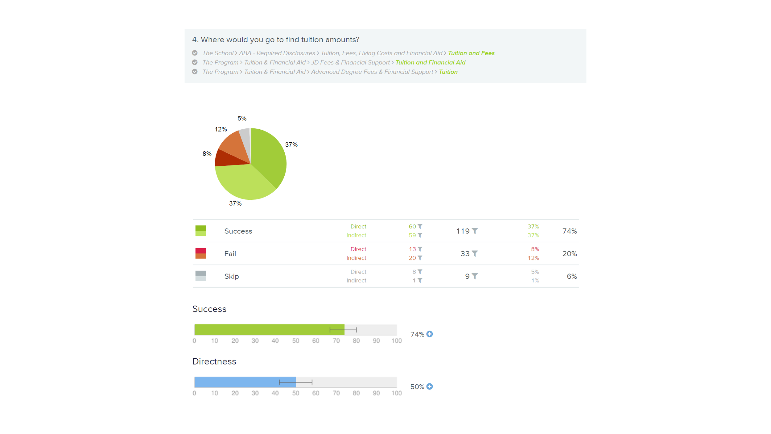
Example Tree test result, not actual case study results
Redesigned Sitemaps
Next, we needed to apply the new navigation to the new sitemaps. Meeting with the product owners, we worked to connect the existing content to the new navigation scheme, keeping in mind that the new navigation was an effort to consolidate the three insurance portals into one.
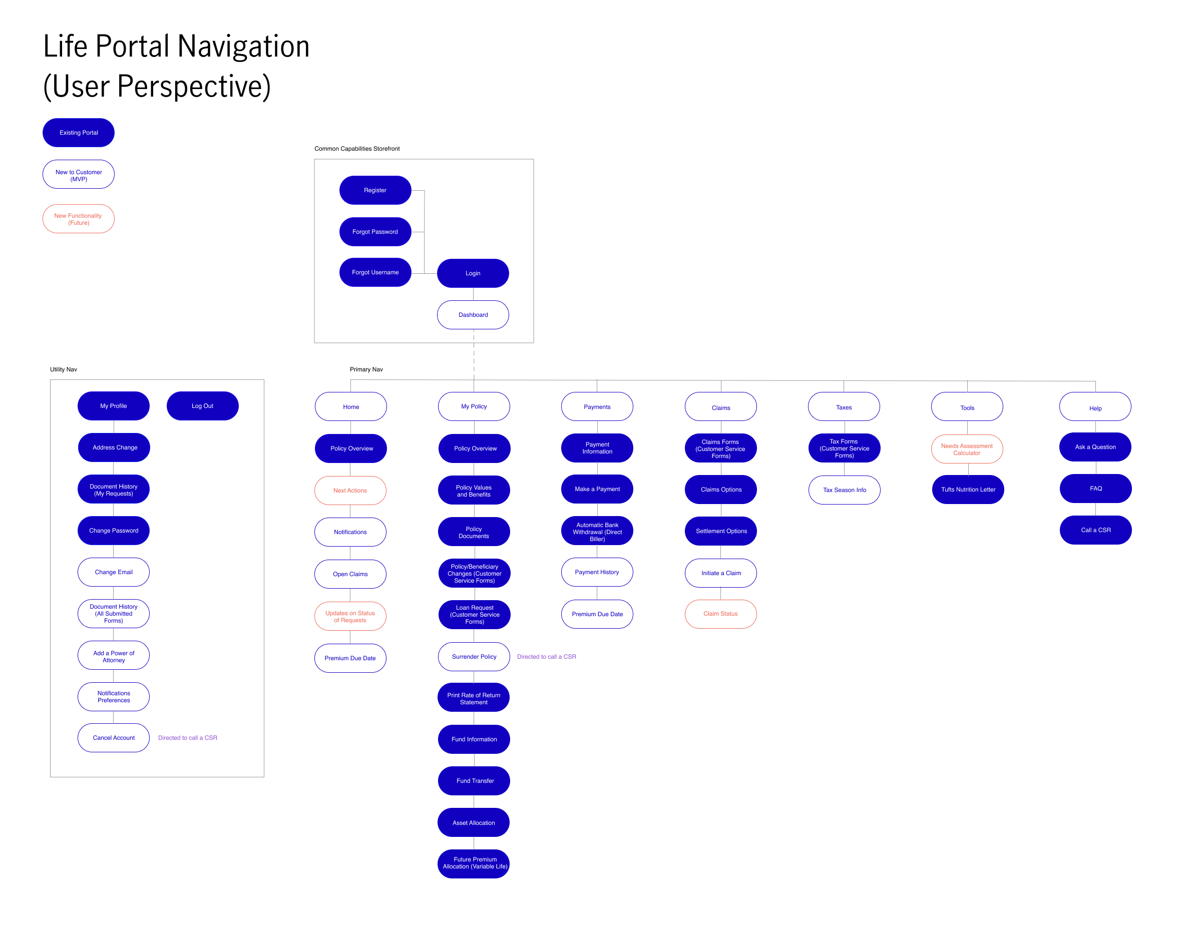
Revised Life Insurance Portal navigation sitemap
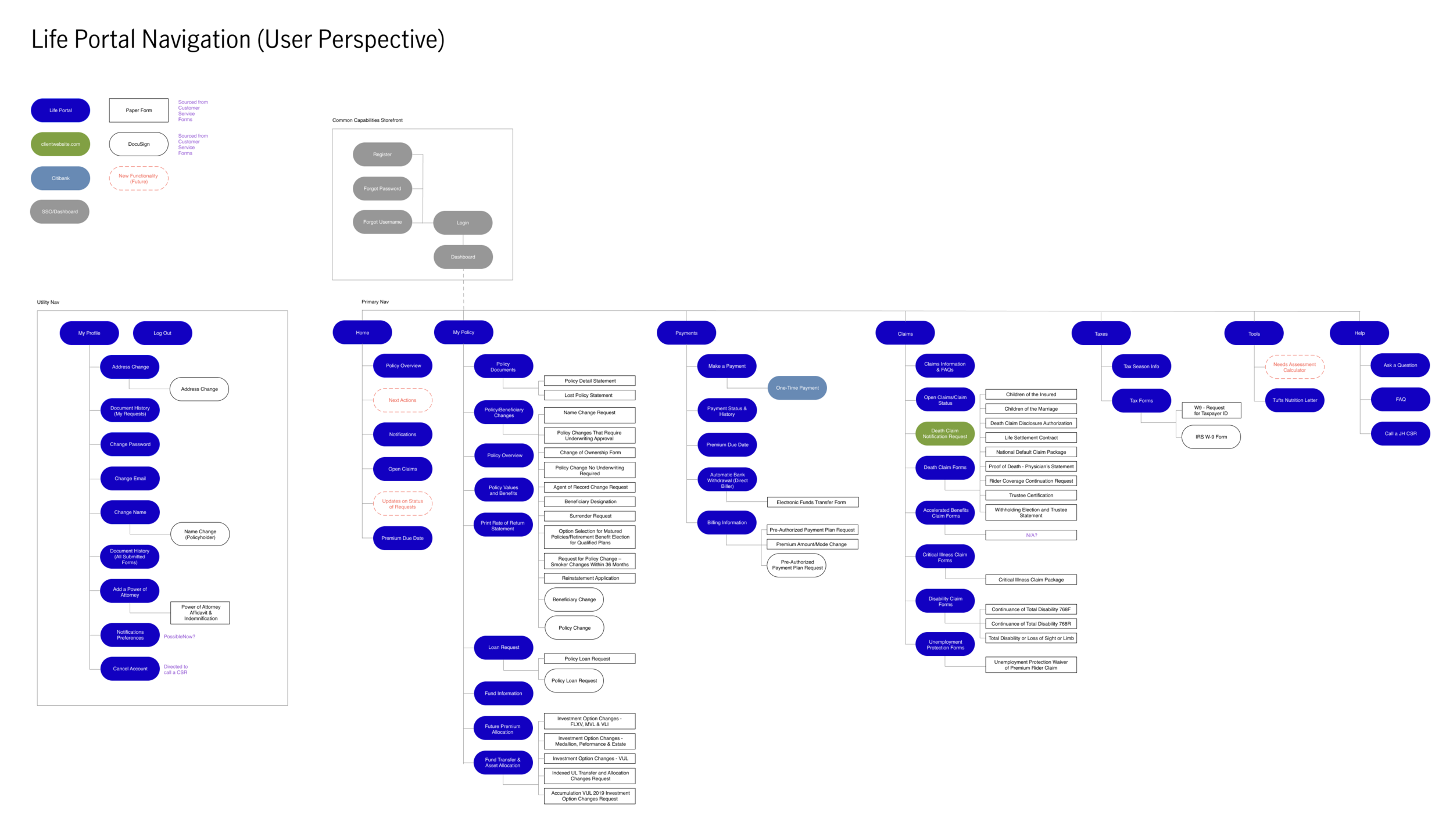
Future state combined portals (LTC, Life, and Annuities) sitemap, Life Insurance Portal portion
New Navigation Demo
As anticipated, combining the three insurance portals into a single experience was a complicated picture to imagine for our stakeholders. To prove that it was possible, we designed prototypes in Figma to demonstrate how users would accomplish their policy tasks with the new navigation.
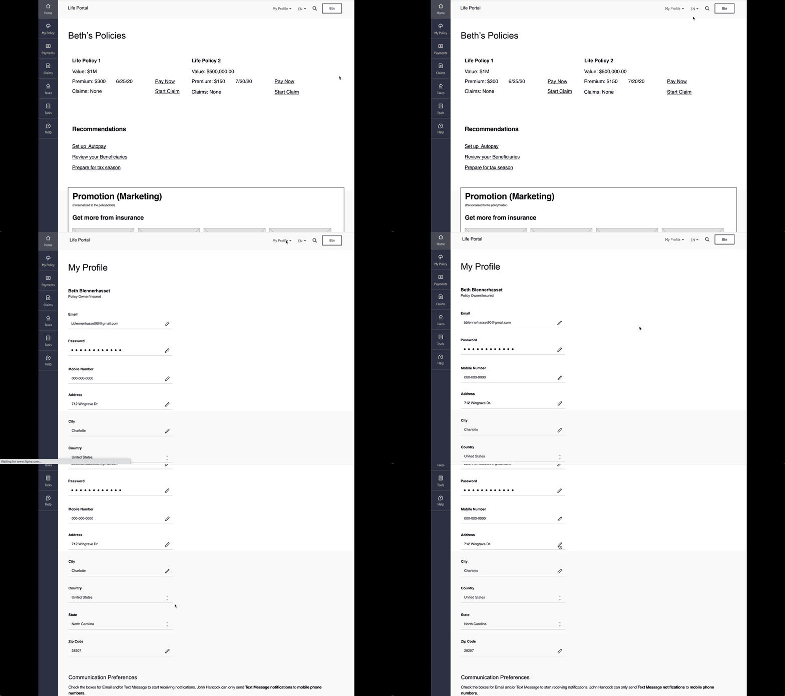
Change policyholder address prototype
Phased Approach
After aligning with our stakeholders we worked with our client and the product owners to draft a plan for building the new navigation for the Long-term Care, Life, and Annuities customer insurance portals.
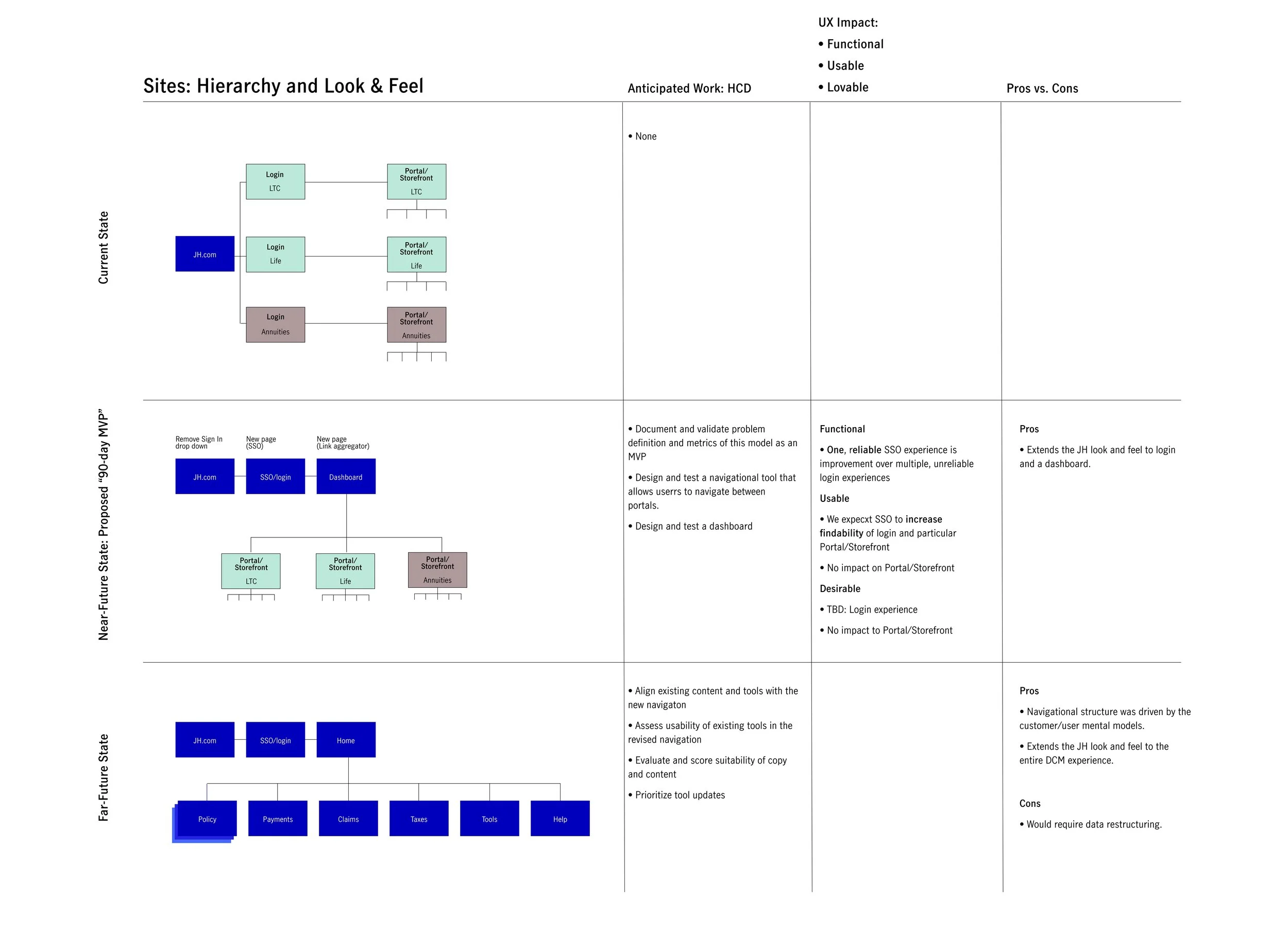
New navigation phased implementation
Next Steps
Provide the client with enough information to make a case with her stakeholders for additional project funding
Create a project roadmap with the client and stakeholders and outline a phased approach for new navigation. The first phase will apply new navigation to the existing Long-term Care and Life customer insurance portals.
Work with the design system team to ensure existing components are being used correctly and advocate for additional components as needed
Conduct additional usability tests based on the task-driven prototypes
Customer Outcomes
Customers can successfully navigate the portal to accomplish their tasks
Customers can confidently act on their policy(ies): submit claims, make premium payments, check benefit status, etc.
Customers can see all their policies in one place
Anticipated Business Outcomes
Reduced number of findability-coded calls to the call center
Improved NPS
Increased portal usage for key tasks like paying premiums or updating a customer’s address on file
Fewer resources required to update the portal