CVS Caremark Mobile Network Operator identity verification
CVS Caremark
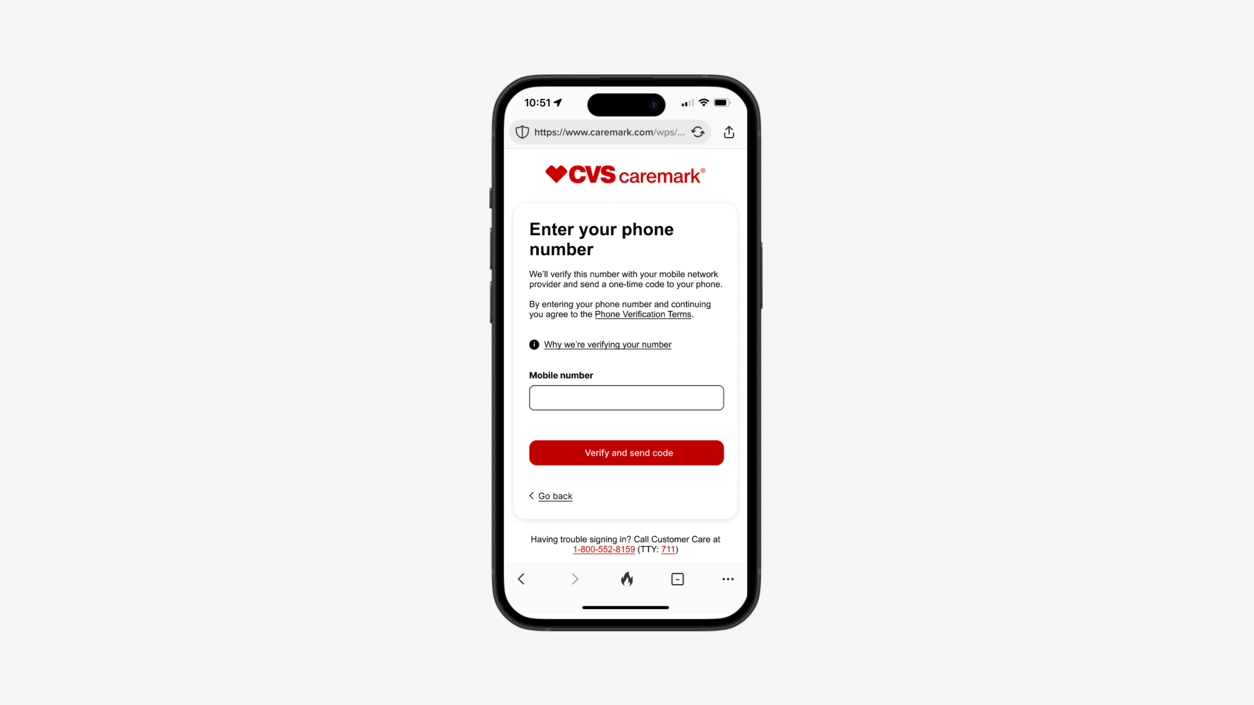
Project Summary
CVS Caremark web and native application (iOS and Android) users verify their identity through 2 factors: (1) a knowledge-based check, username and password, and (2) entry of a one-time passcode. The 2nd step verifies what a user has access to, i.e., they prove they have access to their email address or mobile phone number.
Through intercept surveys and site analytics, my team discovered two major problems that prevented users from proceeding past the 2nd verification step:
Users were not receiving their code in time to enter it because they used the email address option, which we discovered has several variables that impact timely delivery.
Users could not receive a one-time passcode based on the options available to them.
The solution my team implemented, Mobile Network Operator (MNO), resolves this and related dilemmas by allowing users to enter a new mobile phone number before they authenticate. The user's provider, like Verizon, verifies the newly provided phone number and additional CVS Caremark account information, such as first and last name. Once verified, the user can receive a one-time passcode via the new mobile phone number they provided.
As a result, the user can successfully authenticate and access the application. Additionally, they can store the newly provided mobile phone and overwrite their previous phone number, should they desire to do so.
Outcomes
Following the implementation of our solution, we observed the following results:
6.1% increase in sign in success rate (92.1% actual as of August 2023)
3% decrease in sign in difficulty (number of feedback items related to sign in)
5.8% increase in multi-factor authentication sign in success rate (93.8% actual as of August 2023)
Role / Team
Self:
Stakeholder management
Compiled passive research findings (analytics and user feedback)
Facilitated coworking sessions
Reviewed and coached designers usability evaluation research plan
Guided final user interface and experience
Design team:
Information and technical requirements gathering
User flow and logic mapping
User interface design
Content Flesch-kincaid testing
Authored the usability research plan
Platform
Responsive web
Methods
Analytics and customer feedback review
Subject matter expert reviews
Collaborative design sessions
Flesch-kincaid reading level testing
Evaluative usability testing
Information Gathering
Reviewing our customer feedback, site analytics, and several meetings with our engineering and architectural partners we discovered 2 profound issues that prevented users from accessing their accounts:
Legacy accounts
CVS Caremark registration did not require a mobile phone number for several years. This makes receiving a one-time passcode via text only possible for these users if they add a mobile phone number to their account after registration.
“You have only phone and email set up. How about including texting as with this survey. Site required only email and does not have texting.”
Auto-populated account creation
Many (I’m not permitted to say per my NDA) CVS Caremark accounts are batch-created from 3rd party insurance provider data that the user has to add to or change later. If the user does not update their information, they could lose access to their account.
“...when I can get a code it wants to send it to a mobile phone which I don’t have and does not give me the option to receive it via email…”
When these problems are combined, which is the case for many legacy users, users cannot access their account. For example, let’s say a user in this scenario has a new employer. The username and email address are from their previous employer, i.e., an email address they no longer have access to, and by proxy, they no longer have a way to receive a one-time passcode to access their account.
Additionally, as previously mentioned email address as receiver of a one-time passcode is also problematic, specifically from a latency perspective. There a number of factors that contribute delays in receiving a one-time passcode via email, a couple include:
Internet connection/signal strength
Firewall settings
Spam filters
Device performance
-
Mobile Network Operator (MNO) authentication allows users to provide a new mobile phone number as the means to get a one-time passcode for MFA. To make sure the new number belongs to the account holder, MNO confirms their identity by comparing account information provided by their mobile network carrier with their CVS account(s) to see if there is a match (they have the same name, the same address, as well as other identifying details.).
Limitations and technical requirements
A critical factor in the design of MNO implementation was ensuring our users could utilize it effectively and securely. The specifics of how MNO validates mobile phone numbers cannot be addressed directly in this case study for confidentiality reasons. Still, our team, as well as our security partners, deemed it to be a viable option.
Solution limitations:
Limited to only mobile phone numbers that can receive text messages.
No support for voice one-time passcodes; note this is a current limitation of the CVS Caremark multi-factor authentication, not MNO.
No support for VOIP and landline numbers.
Does not support providers outside Prove’s network.
Collaborative Design
My team began by mapping out the existing user flow. From a security and usability perspective, we needed to determine the appropriate part of the flow to introduce MNO; providing help at the right time was paramount to our success. After minimal debate with our security and privacy partners, we determined that the ideal area to introduce the MNO option was on the multi-factor authentication channel selection screen. The page served as the perfect time to introduce the option, as our analytics and user feedback demonstrated that this was where many of our users abandoned the flow.
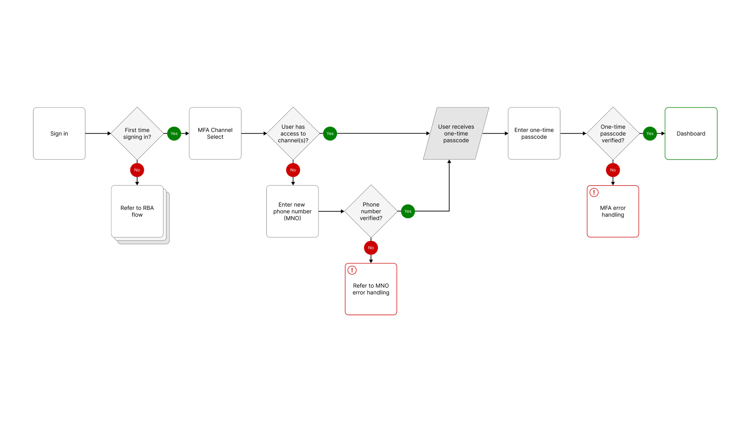
CVS Caremark Mobile Network Operator box flow
Our next interface challenge was to accommodate our liability requirements. As mentioned in the project summary, the use of the MNO API is contingent on the user's discovery and election of consent, a design challenge my team is accustomed to having worked on all things related to security and privacy. However, even given our familiarity with these challenges, this particular legal content proved especially difficult.
First, the content provided by our legal partners was an incredibly dense agreement riddled with jargon. At first glance, my team believed this would be challenging for our users to parse.
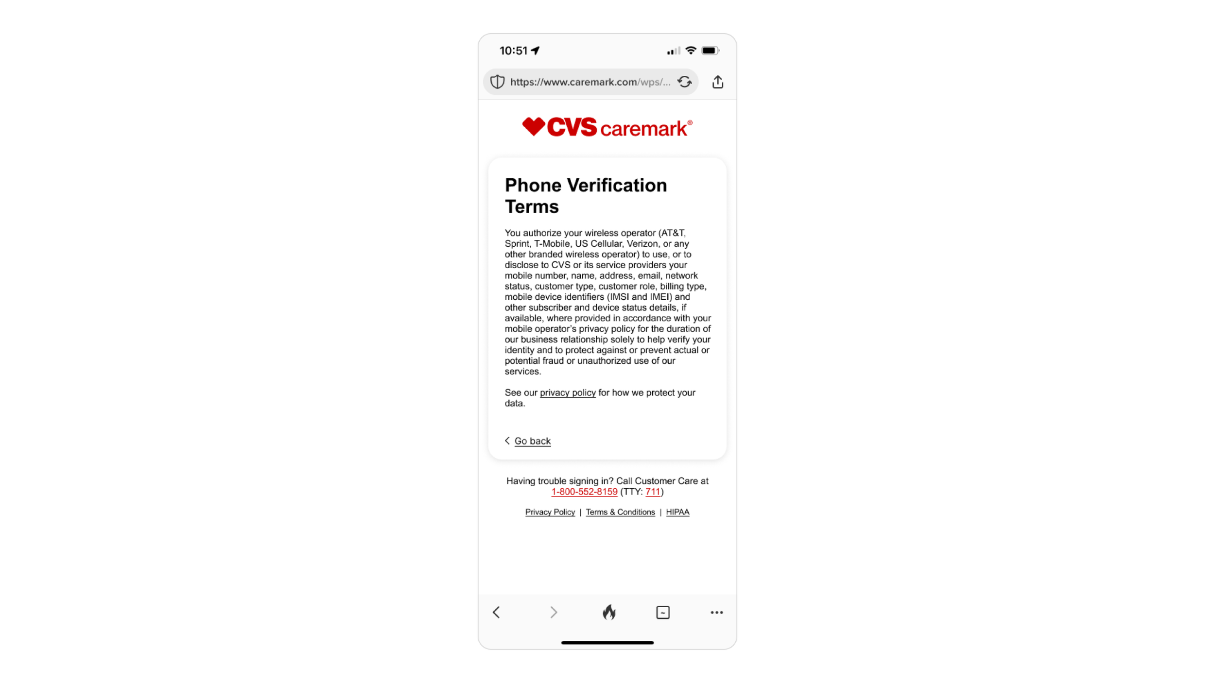
CVS Mobile Network Operator Phone Verification Terms
Some background: CVS Health design team aims to provide readable content at a 5th-grade level. We regularly test our content through Flesch-Kincaid and similar calculators.
Knowing we could not change the agreement, my team drafted and reviewed several iterations of a simplified agreement explanation with our legal partners. Once approved, our next challenge was getting the legal agreement and a simplified explanation into the user interface.
This is where we then had to review various user interface choices. Navigating two large “bricks” of content, my team instinctively opted for solutions including the legal and simplified explanation content outside the main page. The early sketches included buttons that opened modals, expand/collapse (accordion) components that hide and reveal the content, and links to separate pages.
I facilitated working sessions to assess each proposed solution, documenting pro’s and con’s:
Button + Modal
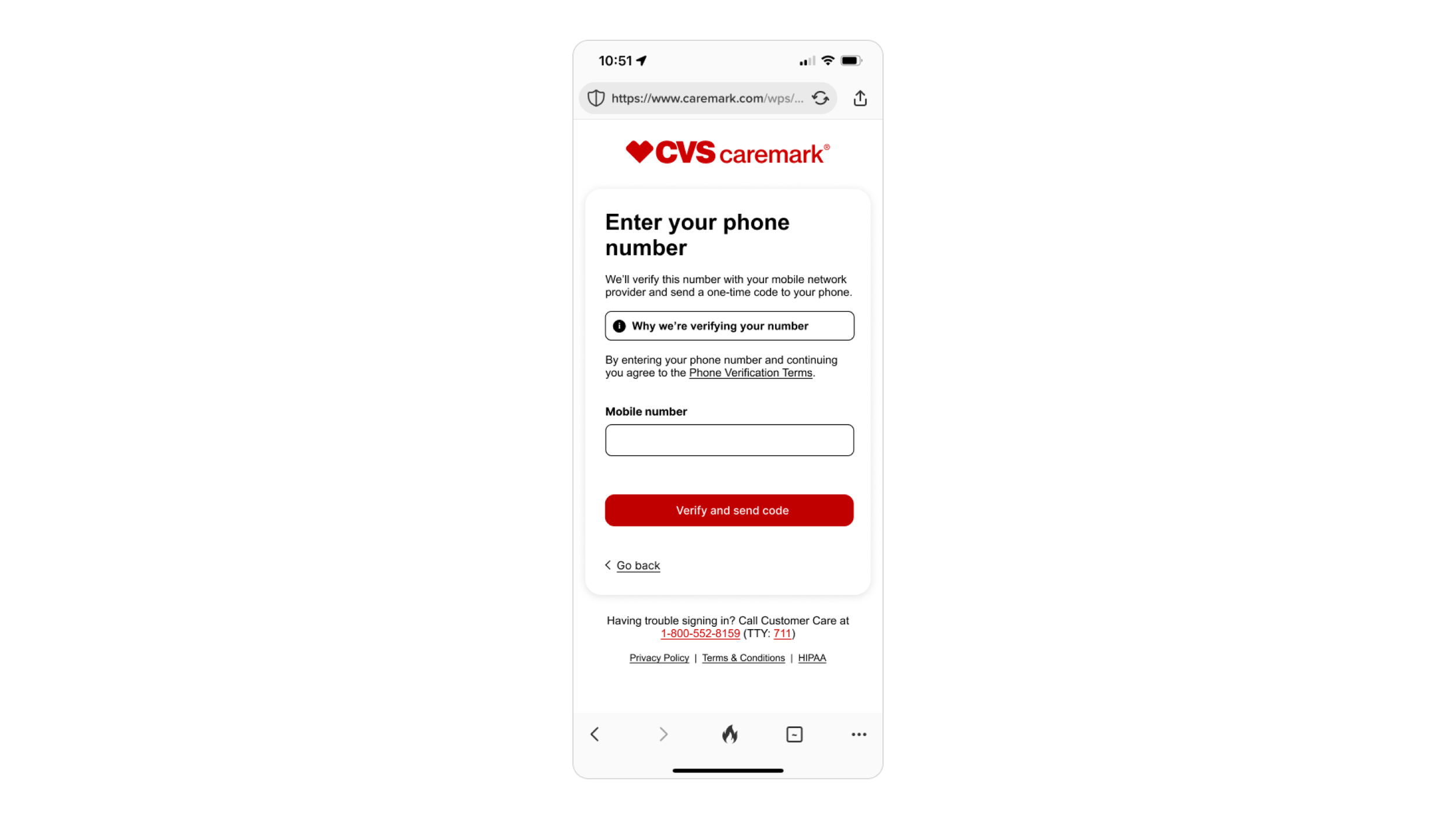
CVS Caremark Mobile Network Operator Enter your phone number screen, button iteration
Pro
The button approach afforded to tuck away the content.
High visibility for sighted users ensured discoverability.
Placing the button before the form ensured discoverability for keyboard and similar device navigation users.
Con
All Pulse web button components require a visible label, and the label to describe the modal was very long, taking up considerable screen space, especially on screen zoom and when the screen text size increases in scale.
Overall, the team felt that the button commanded too much attention for a piece of arbitrary information and needed to be more focused on the screen's primary purpose.
Multiple steps for interaction.
It is less ideal for users with short-term memory loss or similar conditions, as the content is dismissible and not in the context of the screen the form is on.
Expand/collapse
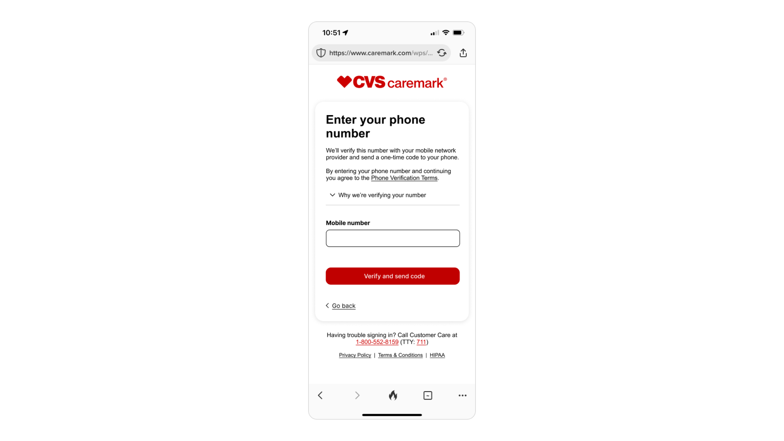
CVS Caremark Mobile Network Operator Enter your phone number screen, expand/collapse iteration
Pro
The accordion approach afforded to tuck away the content while ensuring discoverability.
High visibility for sighted users ensured discoverability.
Placing the control before the form ensured discoverability for keyboard and similar device navigation users.
Con
Like the button, the accordion component spacing and visual elements commanded substantial attention and seemed to distract from the task at hand.
The accordion comes with a higher interaction cost for keyboard navigation users.
Link + Page
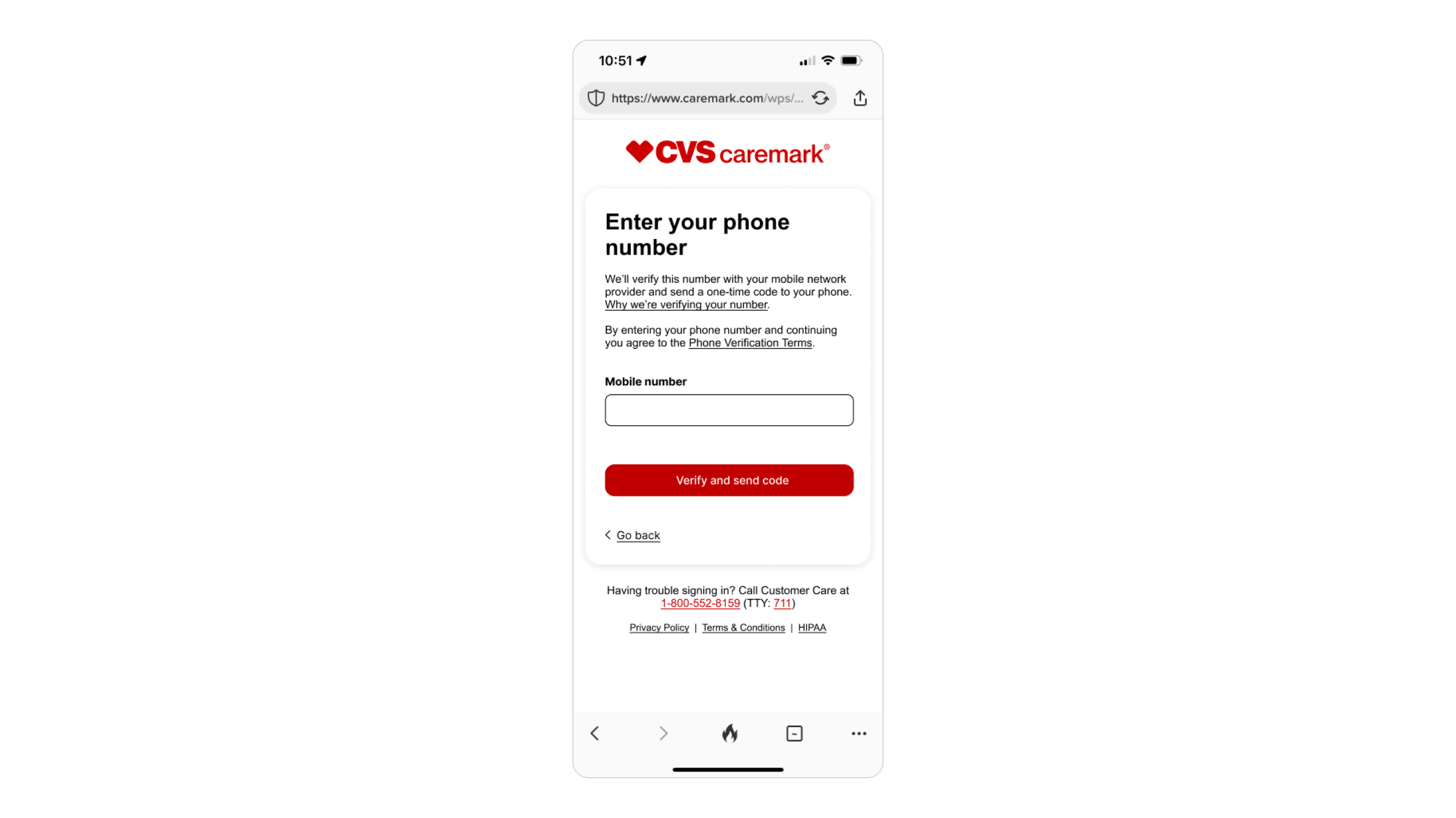
CVS Caremark Mobile Network Operator Enter your phone number screen, inline link iteration
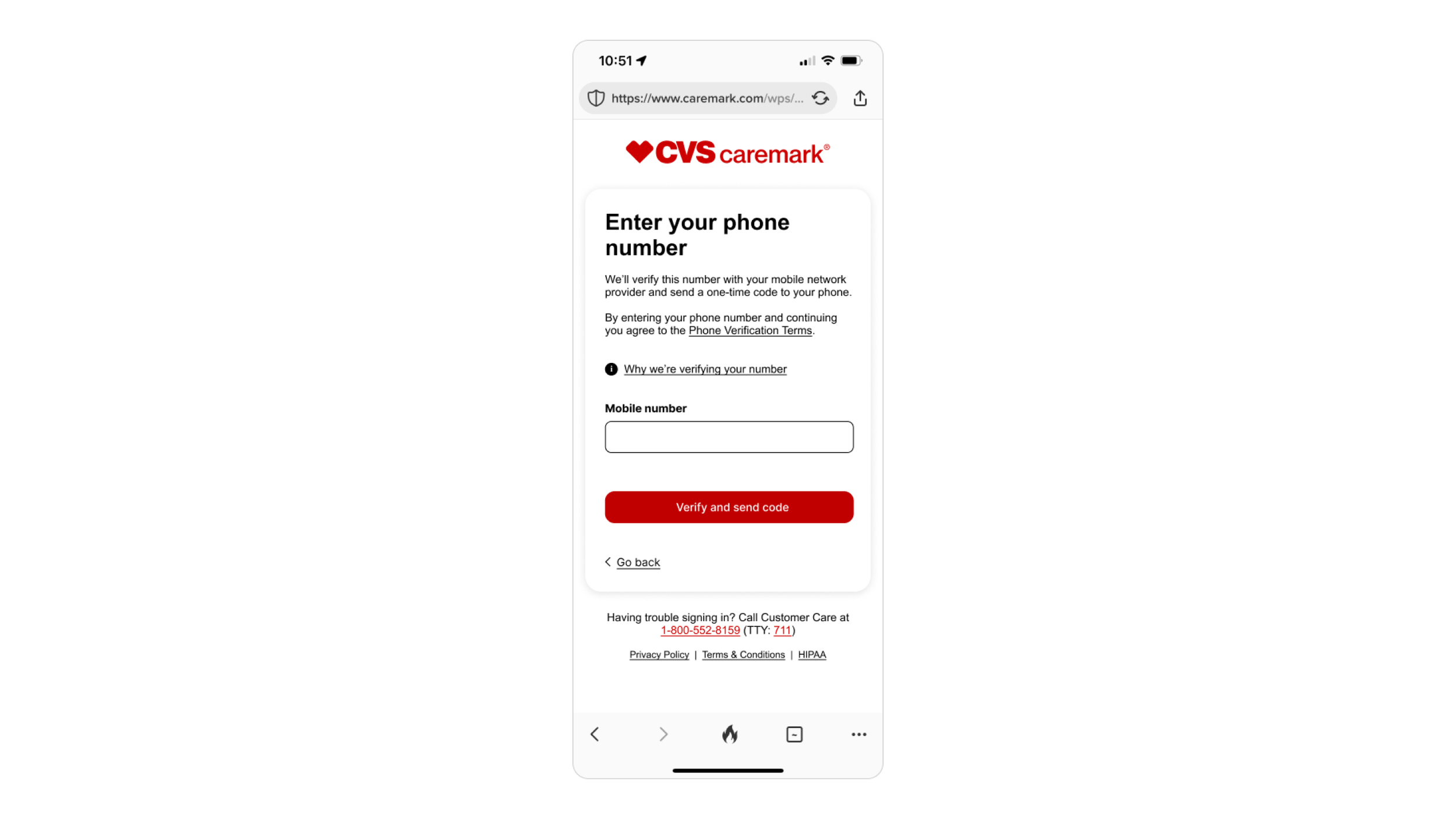
CVS Caremark Mobile Network Operator Enter your phone number screen, standalone link iteration
Pro
The standalone link with an icon felt the most right. We limited the padding and font-weight to save space while keeping an information icon to ensure discoverability.
Placing the control before the form ensured discoverability for keyboard and similar device navigation users.
Con
The team also tried an inline but believed it more challenging to discover and access. Knowing that most of our users would be in a rush and that this step was unrelated to their task, we suspected few would read all the content and miss the link.
Multiple steps for interaction.
Both link options are less ideal for users with short-term memory loss or similar conditions, as the content is dismissible and not in the context of the screen the form is on.
Usability Evaluation
Testing Goal
Evaluate the MNO solution, understand how participants react when they do not have access to the presented mobile phone number or email address.
Research questions
When in a situation where they do not have access to the email address or phone number displayed, will users use the MNO option?
Do users understand the MNO option and what they are consenting to?
What do users think happens with the newly entered phone number?
Method
Unmoderated evaluative usability testing using Usertesting.com. Test participants were asked to sign into their account, imagining they had recently gotten a new mobile phone number and they wanted to check when their prescription was coming. Participants were allowed to sign in with any method they preferred.
Recruiting
7 participants
18+ years old (Caremark requirement)
All participants are CVS customers with a CVS Caremark account
All participants signed into Caremark.com within the last month with a mobile device
All participants currently fill at least one prescription with CVS Caremark
Prototype
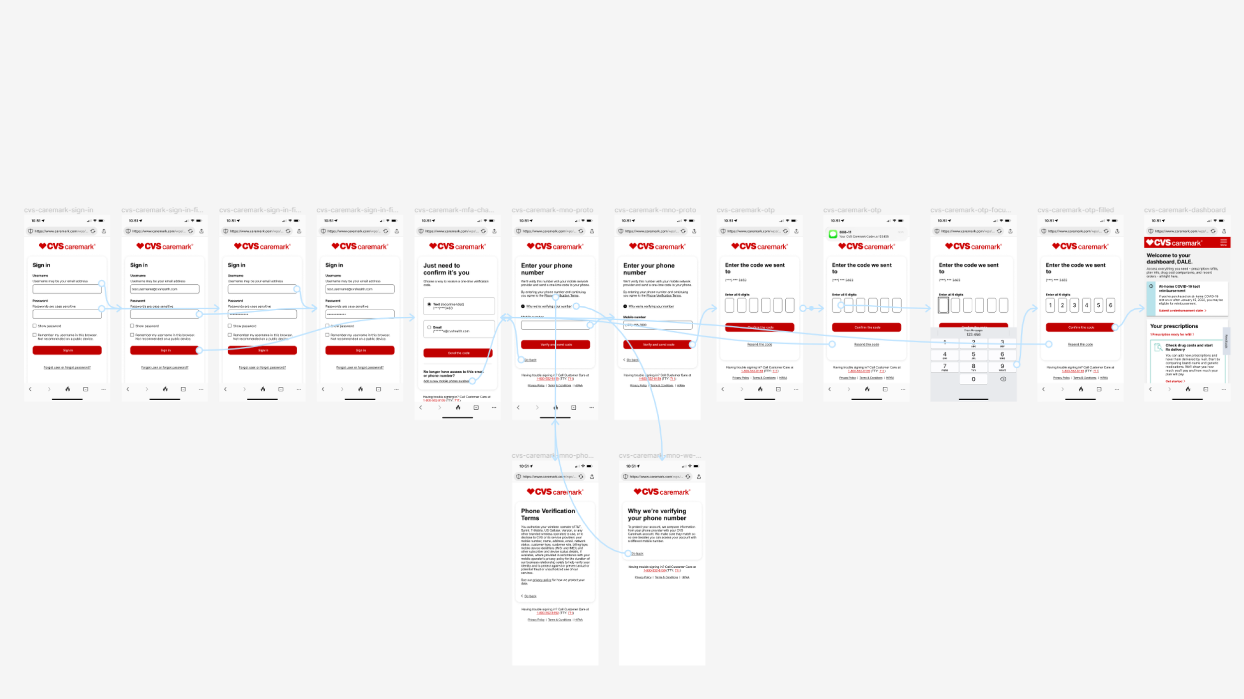
CVS Caremark Mobile Network Operator prototype
Findings and recommendations
All participants said when in a situation where they longer had access to the email address and phone number displayed that they would choose the MNO option.
All participants expressed a definition of MNO and the consent aligned closely with our internal definition.
2 out of 7 participants believed that the newly provided phone number would overwrite their previous phone number. We added a checkbox control post-MVP launch to do precisely this.
Final Design and annotations
As Design Lead it was my responsibility to review and approve all artifacts before handing them over to our engineering partners to implementation. Specifically, I would double check the visual styles and ensure the team used the CVS Health Pulse design system components, interaction, error handling, and flow logic, as well as all the content and accessibility annotations.
Once approved, the designer on my team would do a final walkthrough of the artifacts with our engineering partners and address any questions regarding implementation. Our product and engineering partners would then create quality assurance tasks as part of their users stories so that my team would know when the staging environment build was ready to be reviewed. Once the interactions, styles, were confirmed our product partners would accept the engineering stories and proceed with their throttled launch activities.
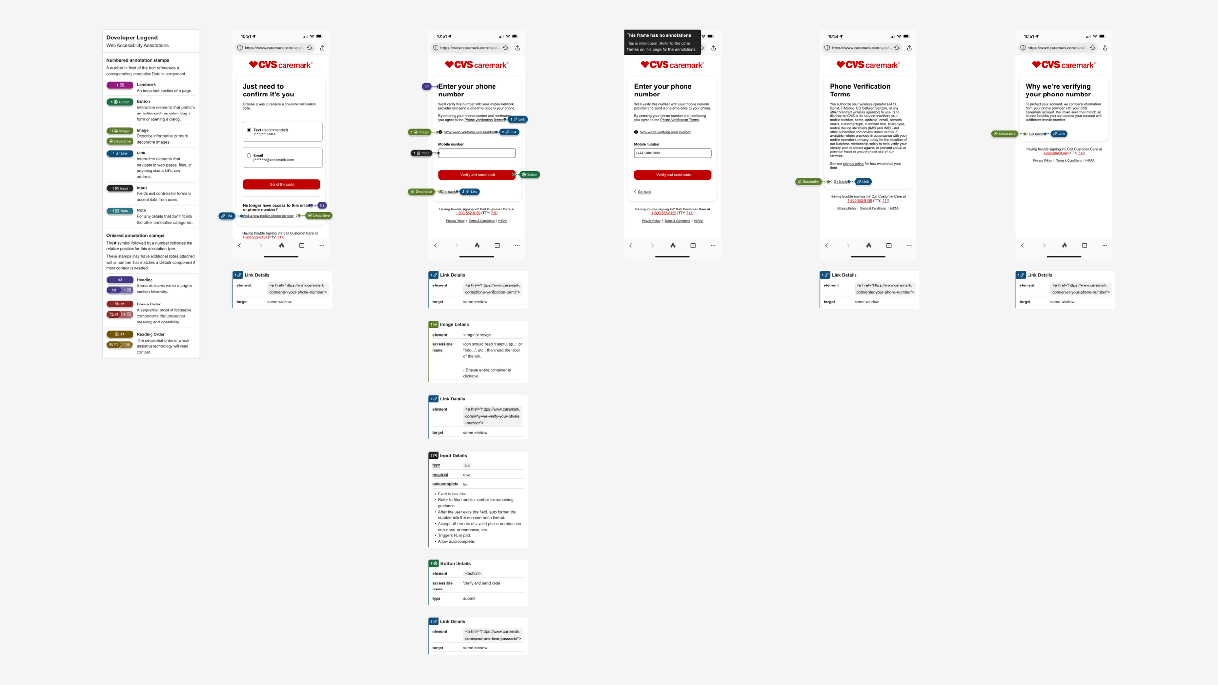
CVS Caremark Mobile Network Operator annotated designs
Post-MVP Enhancements
After we launched our “MVP” MNO feature, we enhanced the experience by allowing users to overwrite the phone number on their account with the newly vetted MNO phone number.
Additionally, I led an effort to scale the solution to our native applications (iOS and Android) and our other business unit applications, e.g., CVS Pharmacy and CVS Specialty Pharmacy.
We also explored additional use cases for MNO, such as adding MNO verification to our account creation process and a niche scenario we discovered where a user might have 0 communication channels available to send a one-time passcode to.
Want to learn more about this case study?

Next case study:
CVS Caremark date of birth multi-factor authentication alternative
Increased sign in success rates with a simpler, secure experience.